
Building Brand Memory Through Visual Consistency
Build brand memory with beauty branding consistency and skincare visual branding that customers recognize instantly. Repeat visuals = stronger recall, better growth.
03 Jul'25
By Niharika Paswan

Building Brand Memory Through Visual Consistency
In a world where every scroll delivers another trending brand, beauty labels can’t afford to be forgettable. The competition is high-gloss, fast-moving, and always innovating. So how do you make a lasting impression, one that sticks long after the screen fades?
The answer isn’t always about more campaigns. It’s about clearer, more consistent ones.
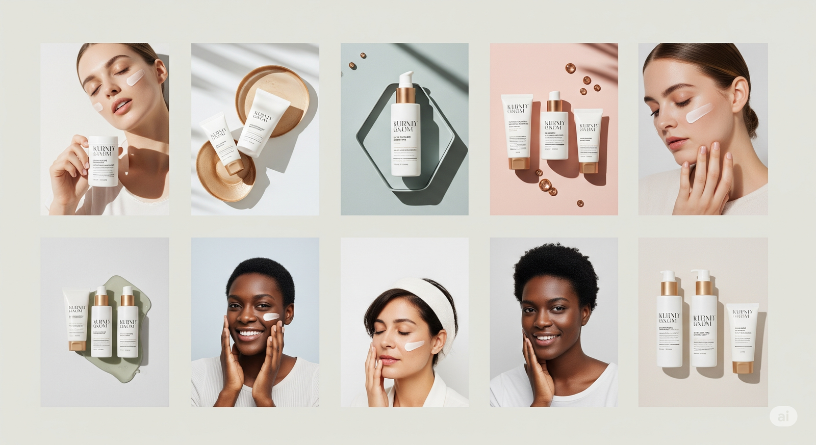
This is where beauty branding consistency becomes more than just a design checklist, it becomes your competitive advantage. The colors, fonts, photography style, packaging cues, and animations all work together to create something customers recognize instantly.
In this article, we’ll break down why visual consistency is the backbone of brand memory, especially in the skincare and beauty world, and how to develop a system that doesn’t just look good but scales with you.
The Cost of Inconsistency
Every time your brand looks or feels different from your Instagram to your unboxing experience, you lose recognition equity. That’s the invisible value you build over time when customers can spot your product at a glance.
Inconsistent skincare visual branding can:
- Confuse your audience
- Lower trust in product quality
- Dilute brand personality
- Make ads feel generic or forgettable
- Undermine long-term retention
Even high-quality visuals can work against you if they don’t align. That new aesthetic trend you just adopted? If it doesn’t fit your brand world, it might spike engagement briefly but it won’t build memory.
What Visual Consistency Looks Like in Beauty

Let’s define it more practically.
Beauty branding consistency means:
- The same tone of voice and style across your packaging, campaigns, website, and socials
- Cohesive photography lighting and editing
- Consistent typefaces and placement of product information
- Motion and animation styles that feel familiar across launches
- Swatch or texture visuals that follow a recognizable format
- Skin tone representation that reflects your brand values
This doesn’t mean you can’t experiment. But every new visual direction should still feel like it’s speaking the same language.
Why It Matters More in Skincare
In skincare, consistency isn’t just a design strategy, it’s a psychological anchor.
Customers rely on visual cues to:
- Build product trust
- Remember which variant they used before
- Identify efficacy through packaging
- Spot updates or new lines
Think about the visual consistency of legacy skincare brands: clean, pharmaceutical-style fonts, muted palettes, clinical layouts. That’s not accidental, it signals credibility.
Your skincare visual branding should do the same: reflect your brand’s purpose through repetition, not randomness.
The Role of Visual Systems
Strong visual branding isn’t about creating one perfect ad or launch graphic. It’s about creating a system that can scale with your brand.
A visual system includes:
- A style guide with defined fonts, colors, tone, and animation principles
- Templates for reels, stories, carousels, email banners, etc
- Swatch formats and product demo guides
- Packaging hierarchy (how ingredients, benefits, names are visually displayed)
- Brand-approved transitions, filters, or graphic elements
This allows every team: designers, marketers, influencers, web developers to build on brand without guessing.
Visual Systems That Scale With You
At Admigos, we help beauty brands build consistent visual systems that grow with their product lines, content needs, and audience evolution.
From swatch animations to multi-SKU brandbooks, we create repeatable templates and motion styles that keep your identity strong, even as your brand expands across platforms and markets.
Because growth without consistency is noise. But consistency with creativity? That’s brand memory in motion.
Common Visual Consistency Mistakes and How to Fix Them
1. Changing Aesthetic Too Frequently Trend fatigue is real. When you hop from one vibe to another, your audience can’t keep up and won’t remember you.
Fix: Evolve your brand visually, don’t restart it. Introduce changes slowly and tie them back to existing assets.
2. Disconnected Product Visuals Your PDP page looks clinical, but your Instagram is full of moody edits. Customers feel confused about what your product is.
Fix: Create a central reference board for every product like mood, lighting, skin tone diversity, motion language. Stick to it.
3. Inconsistent UGC Integration UGC is gold, but raw content can clash hard with your polished brand world.
Fix: Develop a UGC visual framework. Add branded overlays, unify color tones, or animate intro and outros to anchor the content visually.
4. Mismatched Packaging and Digital Branding Your bottle looks luxe but your website feels DIY or vice versa.
Fix: Treat packaging as part of your full visual identity, not a standalone. Use the same font styles, textures, and color hierarchy in both.
Visual Touchpoints That Build Brand Memory
Every time your customer interacts with your brand, they get a visual cue. Repeat it enough and they’ll start recognizing you instantly.
Make sure these are consistent:
- Instagram grid: color tone, graphic style.
- Product packaging: especially across variants.
- Website: headers and banners.
- Email design: GIFs, banners, icons.
- Ad creatives: across platforms.
- Unboxing experience: thank you cards, print textures, inner pack shots
- Retail displays or pop-ups.
The more aligned these touchpoints are visually, the more you reinforce what your brand stands for, even without saying a word.
Building Consistency for Emerging Brands
If you’re a growing beauty brand, you might not have a full-time art director yet. That’s okay. You can still build consistency with a few foundational tools:
- Brandboard: 1-page summary of fonts, colors, imagery style
- Motion guide: Define animation types you use (e.g. swipe transitions, slow zooms, looped textures)
- Swatch formats: Set a template for reels or product pages
- Launch kit template: Make every product drop feel uniform (same graphic order, layout, vibe)
- Photography brief: Guide freelance shooters with reference images and lighting direction
Consistency is about preparation, not budget. A few guardrails go a long way in making your content feel premium, even with a small team.
Earning Recognition in a Scroll-First World
The goal of beauty branding consistency is simple: when someone scrolls past your ad, post, or email, they know it’s you without reading the handle.
This is how you go from being a new brand to a remembered one. Visual branding isn’t static, it’s a memory trigger. It builds trust. It encourages repeat buys. It deepens identity.
And the best part? It compounds. The more consistent you are, the more every piece of content adds to your long-term equity.
Final Thought: Repetition Is Reputation
Your brand’s visual voice is how people remember you and how they decide to buy from you.
If your content looks different every week, your audience has to re-learn who you are every time. But if you build a system: one that anchors every reel, carousel, pack shot, and email in a recognizable style, you make it easy for them to remember you.
That’s how beauty brands go from trend to staple. Not by shouting louder. But by showing up visually, again and again, in a way only you can.
How to Nail First Impressions With Website Visuals
Nail first impressions with beauty homepage tips and landing page visuals for skincare that convert in seconds. Craft stunning, scroll-stopping site visuals that sell.

How to Localize Visual Campaigns Without Losing Brand Voice
Learn how beauty brands adapt visual campaigns for India’s diverse markets without losing brand identity. Includes research, examples, and expert quotes.
