How to Nail First Impressions With Website Visuals
Nail first impressions with beauty homepage tips and landing page visuals for skincare that convert in seconds. Craft stunning, scroll-stopping site visuals that sell.
03 Jul'25
By Niharika Paswan


How to Nail First Impressions With Website Visuals
Three seconds. That’s how long your website has to convince someone they’re in the right place. Before they scroll. Before they click. Before they even think. In the beauty space, where aesthetics and trust carry serious weight, those three seconds are everything.
Your homepage isn’t just a digital brochure. It’s your brand’s handshake. A silent pitch. And your visuals? They’re speaking before any copy does.
Whether you’re launching a new skincare line or rebranding an established cosmetics range, this article will break down how to build landing pages and homepages that converts fast. We’ll unpack what makes beauty brands stand out at first glance and explore the beauty homepage tips and landing page visuals for skincare that actually drive clicks, scrolls, and sales.
Why First Impressions Start With the Visuals

Most visitors make an unconscious decision about your site within seconds. Not based on product specs. Not based on copy. But purely on how it feels visually.
When someone lands on your homepage, they’re asking themselves:
- Does this look premium?
- Can I trust this brand with my skin, body or image?
- Is this for someone like me?
- Is it worth my time to explore more?
Your site has to answer "YES" instantly. Visuals are the only part of your brand that can do this at speed and scale.
What Beauty Consumers Expect From a Homepage
Today’s beauty shopper is visually trained. She’s been fed brand after brand through Instagram, YouTube, TikTok, and Sephora.com. And she’s got a taste for sharp design.
So what are they expecting when they land?
- Clean layout with breathing space
- Premium product photography, not just pack shots, but in-skin and in-context
- Fast loading hero sections with movement or layered visuals
- Visually distinct typography that signals category and price point
- Interactive cues that guide where to scroll or click
If your homepage looks like a generic Shopify template, they’ll bounce. But if your visuals feel custom, smooth, and intentional, they’ll stay and scroll.
Beauty Homepage Tips That Actually Drive Engagement
Here’s how to sharpen your homepage so it starts performing like a flagship storefront:
1. Design the Hero Like a Visual Hook

This is your first punch. The first 600 pixels. It should deliver vibe and clarity together.
Best practices:
- Use motion: subtle animation, hover effects, or video headers
- Show product and payoff: texture, swatch, or transformation
- Keep copy minimal: one line with emotion, one CTA
- Include skin or model context early (not just floating packs)
Your hero is not for explaining. It’s for convincing.
2. Use Scrolling Layers to Build Story
.png)
Let users uncover your brand in visual chapters:
- Section 1: Emotion (hero)
- Section 2: Product showcase
- Section 3: Ingredients or benefits
- Section 4: Social proof or testimonials
- Section 5: Brand story or values
Use color shifts, full-bleed imagery, and animation between layers to make scrolling feel fluid. This visual rhythm makes a landing page feel alive.
3. Prioritize Mobile Visual Experience
.png)
Over 70% of beauty shoppers will land on your site via mobile. Your visuals must adapt beautifully:
- Vertical crops for all hero sections
- No over-compressed images
- Tap-based animations or swatch toggles
- CTA buttons that are finger-friendly
Your desktop homepage can’t just shrink. It has to evolve.
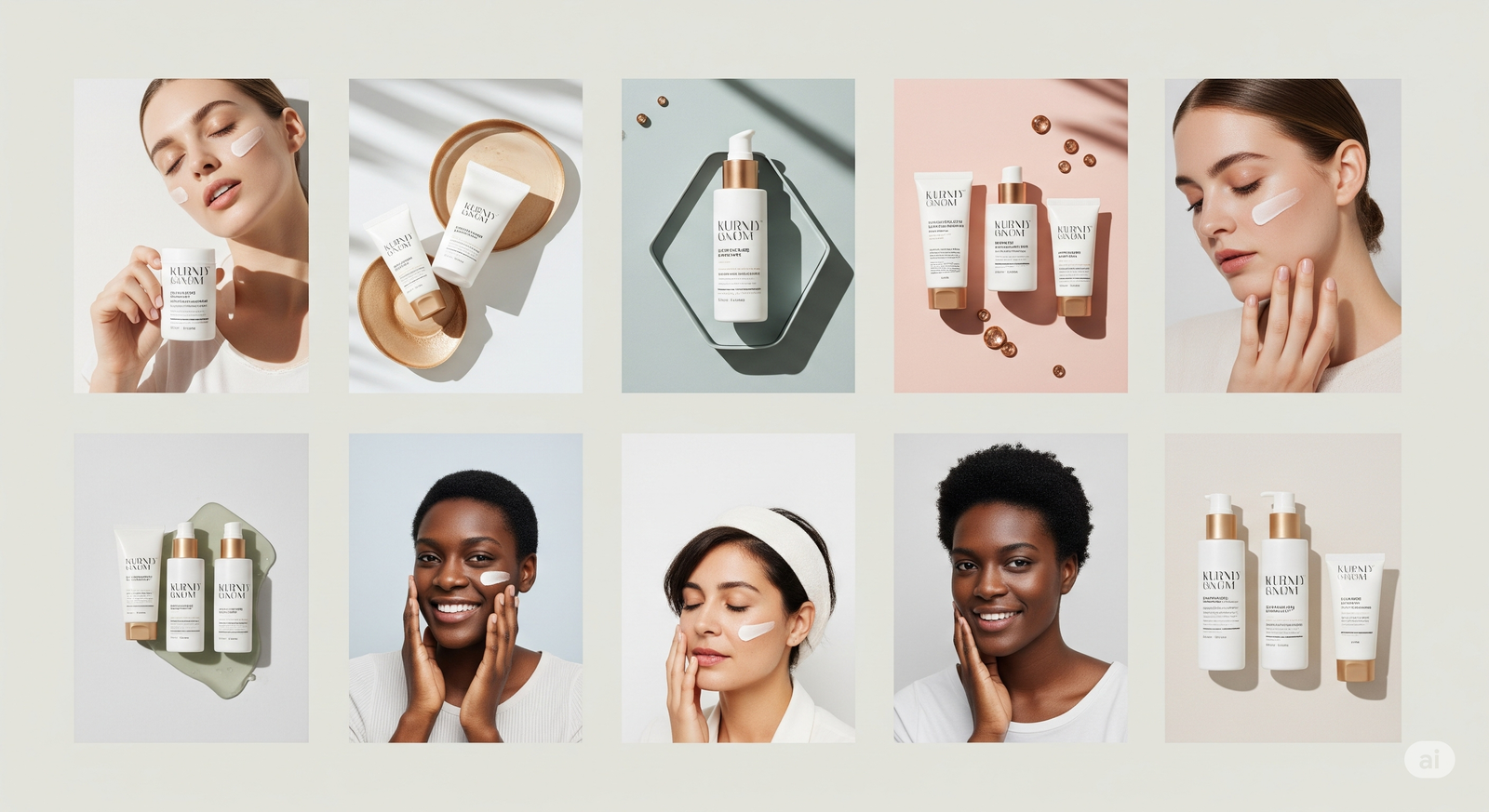
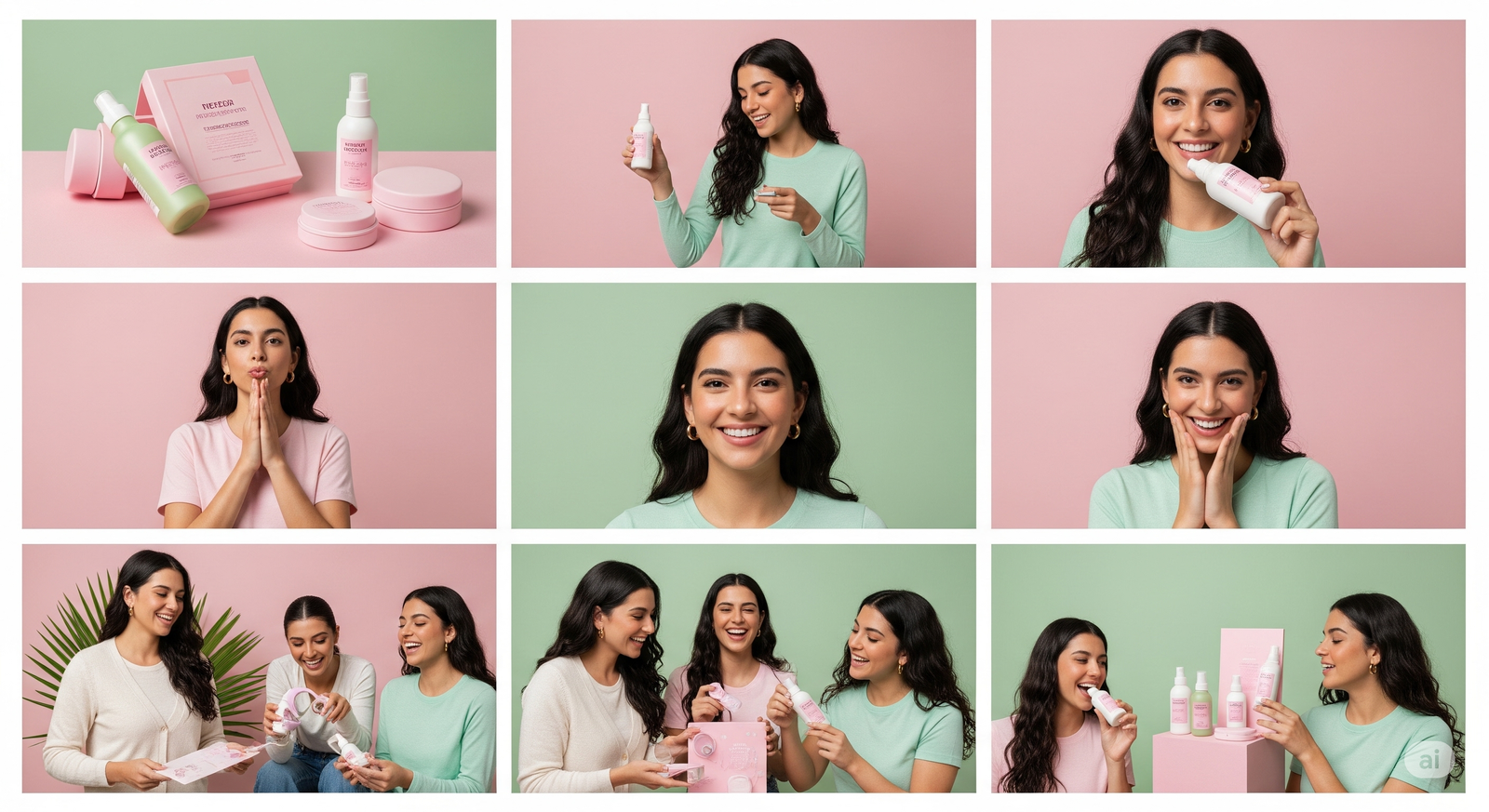
4. Blend Product and Lifestyle Imagery
.png)
Customers want to see both how a product looks and how it lives. Include:
- Macro textures or application close-ups
- Model shots in daily rituals
- Visual stories around usage moments (e.g., “morning glow,” “on-the-go,” “post-cleanse”)
Your landing page visuals for skincare should always answer: how does this product feel in real life?
Interactive Visuals That Convert
At Admigos, we craft website visuals that go beyond the static. Think: animated hero banners, swatch reveal interactions, scroll-triggered storytelling, and homepage loops that feel more like campaigns than landing pages.
We build landing page visuals for skincare that turn browsers into buyers and help beauty brands own those first three seconds with precision.
Our approach helps beauty brands set the tone with visual clarity, brand polish, and content that keeps users hooked.
Visual Triggers That Improve Conversion
Great visuals aren’t just pretty, they’re strategic. Here are visual elements that can lift homepage and landing page performance:
- Swatch animations: Showcase shade shifts, coverage levels, or texture payoff
- Sticky cart previews: Keep key items visually anchored as users scroll
- On-hover movement: Let product cards reveal details on interaction
- Visual filters: Use color-coded icons or images for skin type, concern, or tone
- Ingredient visuals: Show where your ingredients come from with photography or animation
- Before and after sliders: Especially powerful in skincare
Every touchpoint should not only look good but functionally communicate value.
Landing Page Visuals for Skincare: Dos & Don’ts
Do:
- Show texture in motion
- Use real skin, not AI-style renders
- Add animated overlays with ingredient callouts
- Feature routine pairings in grid layouts
- Include results-driven UGC visuals
Don’t:
- Rely solely on flat product renders
- Overload with copy in the visual frame
- Ignore mobile layout
- Use heavily retouched skin visuals
- Forget CTA hierarchy, every scroll should lead somewhere
What to Test Visually And Why
Want to optimize your homepage without a full redesign? Test small visual switches:
- A or B hero visuals: Model shot vs texture payoff
- CTA design: Color, size, placement
- Homepage loop video: Yes or no?
- Social proof position: Top vs bottom vs integrated
- Visual hierarchy of product tiles: Add-on features like “bestseller” or “editor’s pick” badges
These micro changes can have macro results in session duration, bounce rate, and add-to-cart actions.
Final Thought: Looks Do Matter
In beauty, looking good isn’t vanity, it’s strategy. And nowhere is that more true than your homepage.
Your audience decides in seconds if you’re worth their trust, their time, and eventually their money. But the good news? Visual storytelling is a superpower you can control.
By following smart beauty homepage tips and investing in layered, emotionally resonant landing page visuals for skincare, you give your brand the edge it needs, right at the very first glance.
So build for impact. Load fast. Look sharp. And let your visuals do what they’re meant to: make people stay.
What’s Missing from Your Influencer Campaign? (Hint: It’s the Visual Narrative)
Most influencer campaigns miss the mark without strong brand storytelling. Build an influencer campaign beauty brand strategy with visuals that drive recall and impact.
Building Brand Memory Through Visual Consistency
Build brand memory with beauty branding consistency and skincare visual branding that customers recognize instantly. Repeat visuals = stronger recall, better growth.