
Why Premium Packaging Drove D&G Light Blue’s Comeback
Dolce & Gabbana Light Blue’s comeback proves premium packaging still sells. Explore how visual storytelling gave this iconic fragrance a second life
17 Jun'25
By Amanda

Why Premium Packaging Drove D&G Light Blue’s Comeback
There’s something instantly nostalgic about D&G Light Blue. The name alone can conjure memories of seaside air, sunkissed skin, and 2000s summer flings. But as iconic as the fragrance was, even icons need a refresh. After years of lingering on shelves and in memory, the once-beloved scent staged a striking comeback and no, it wasn’t because they changed the juice.
It was the packaging.
Clean. Tactile. Premium. A look that redefined where Light Blue stood in today’s crowded, scroll-hungry fragrance market. In a world where scents can’t be smelled online, Dolce & Gabbana made sure people could feel the luxury before opening the bottle. This was more than a facelift. It was proof that premium packaging is no longer a finishing touch; it’s the first conversation a brand has with its audience.
From It-Girl to Afterthought
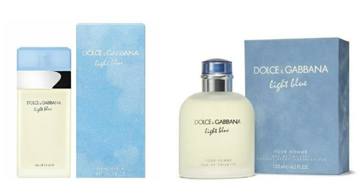
Let’s rewind. When Light Blue first launched in 2001, it was revolutionary. A citrus-floral blend that somehow bottled the Mediterranean lifestyle. Its translucent bottle with baby-blue accents was simple, stylish, and everywhere.
But as the fragrance industry evolved, moving into bolder bottle silhouettes, sculptural caps, and digital-first experiences, Light Blue started feeling old and dated. The product itself hadn’t changed, but the visual language around it hadn’t kept up with the pace of modern luxury. Gen Z and younger Millennials weren’t buying memories; they were buying aesthetic-forward experiences. And on the shelf, Light Blue had lost its edge.
The Packaging Rebrand That Changed Everything
Rather than reinventing the formula, D&G chose to reposition the story, and they did that visually.
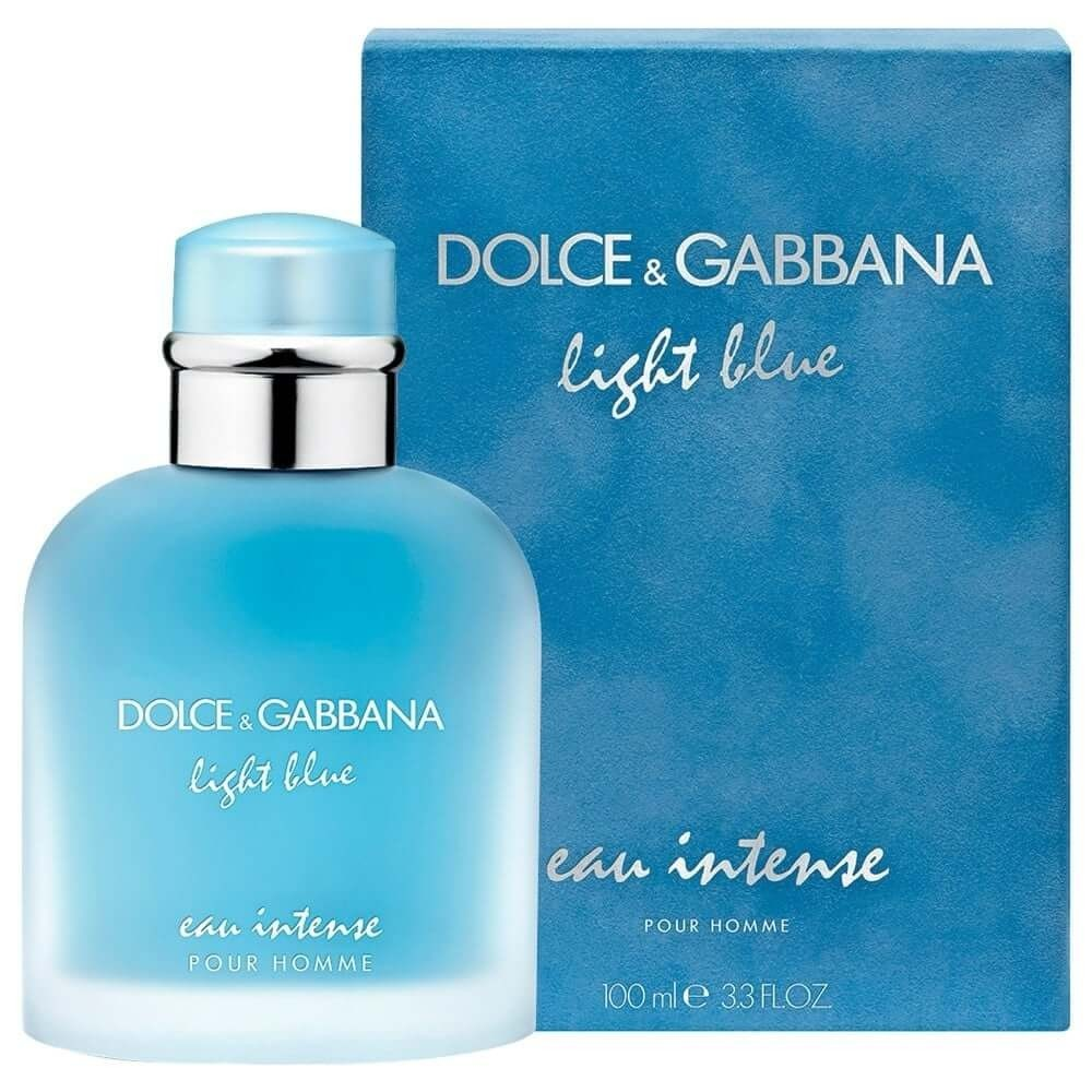
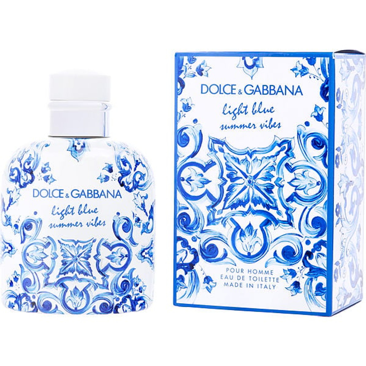
The newer iterations of Light Blue, especially Light Blue Forever, signalled this shift. The box featured a deepened oceanic blue, matte suede finishes, and subtle embossing. It was a callback to the original, yes, but it was sleeker, heavier in the hand, and deeply touchable. The kind of box you didn’t want to throw away. The kind of bottle you’d keep on display.
This wasn’t loud luxury. This was confidence. And it worked.
The fragrance packaging trend had officially shifted: from overly ornate to rich restraint. D&G’s bet on subtlety over sparkle paid off, making Light Blue relevant again for a new generation. It no longer screamed youth, but it whispered timelessness. That whisper was loud enough to pull buyers back.
When Packaging Leads the Campaign
In an era dominated by product hauls and unboxing reels, the value of packaging isn’t theoretical; it’s trackable. According to a 2024 NielsenIQ report, 71% of first-time fragrance purchases are visually driven, with 43% influenced directly by packaging design alone.
Think about that. Nearly half of all customers are sold before a scent even hits their skin.
So when Light Blue returned with new packaging, the campaign didn’t lead with the scent profile. It led with feel. Velvet-touch visuals. Close-up texture shots. Storyboards that highlighted shadow, curve, and sheen. It invited consumers not just to buy, but to interact.
At brands like Admigos, this is exactly the kind of story we help brands tell, bringing your premium look to life before it ever hits a shelf. For beauty brands launching a product in 2025, that first moment on TikTok, on a website, in the palm of someone’s hand, is the campaign.
At Admigos, they help brands:
- Prototype luxury packaging through animated product rollouts.
- Create 360° mockups before production begins.
- Develop campaign visuals that highlight material, lightplay, and form.
- Turn unboxing into emotional experiences with motion graphics and tactile simulation.
And with fragrance? That moment has to be visual, because the product itself can’t speak until it’s unboxed.
What Made Light Blue’s New Look Work?
The new packaging didn’t just look better. It did more.
It invited touch. The box used suede-soft flocking, a material that added dimensionality and made it feel expensive before even seeing the bottle. The logo was embossed instead of printed, providing visual relief in a sea of overdesigned boxes.
It streamlined visual storytelling. Every element of the new packaging aligned with the brand’s storytelling. From Pantone-matched hues of Capri seas to the arching bottle curves, it wasn’t random. It was a curated emotional signal that said: you already know this scent, you just forgot how good it felt.
It captured luxury on camera. Whether in unboxing videos or display shots, the new premium look popped without having to try hard. No glitter. No over-branded design. Just texture, symmetry, and emotional clarity.
Visual Design as ROI
Let’s talk numbers. In the U.S. and Europe, D&G reported a 16% increase in sales for the Light Blue franchise after its rebrand. On platforms like Sephora and Ulta, updated product pages featuring enhanced packaging visuals saw higher engagement and add-to-cart rates.
Retailers responded too. Nordstrom and Selfridges both featured Light Blue more prominently post-redesign, citing its refreshed shelf presence and better alignment with modern luxury aesthetics.
This is the ROI of good design: it makes the product easier to market, to photograph, to love, and to buy.
Because in the fragrance industry, where scent is silent until sprayed, your packaging has to do the talking. And in a premium world, it doesn’t shout it seduces.
The Future of Fragrance Packaging Trends
Looking ahead, the Light Blue revival signals something bigger: a return to quality over chaos. We’re seeing fragrance packaging trends tilt toward monochrome palettes, minimalist fonts, and tactile luxury that’s felt before it’s seen.
And buyers? They’re responding.
They want their fragrance to feel intentional. To look like it belongs in their world, not just on a department store shelf. They want packaging that is personal now. One that is subtle, emotive, and, most importantly, designed to last.
#fragrancepackagingtrends #premiumlook #dolcegabbana #lightbluecomeback #packagingdesignmatters #admigosvisuals #beautyunboxing #aestheticpackaging #luxuryfragrancebox #packagingroi